A new look for rainbowR
rainbowR has a new look! This post reveals our new visual identity and describes the process of putting it together. In particular, it highlights the LGBTQ+ designs that inspired and are incorporated into the imagery.
The project
This summer, we’re giving two talks about rainbowR at the season’s biggest R conferences: useR! 2024 and posit::conf(2024). That got us (the rainbowR team) thinking not only about what we say, but also how we look. We decided it was time to refresh the rainbowR visual identity.
The brief for the new imagery was that it should be identifiable LGBTQ+ (i.e. rooted in LGBTQ+ graphic design history) and that should be linked to the R language by incorporating the R from the R logo. Since the community name is rainbowR, we also felt that the new designs should incorporate rainbow colours. It was also really important that the design should feel inclusive (just as the community is). Moreover, we wanted the designs to be bright, clean, fun, modern, and geometric.

The inspirations
I began the research by searching online for ‘LGBTQ+ graphic design’ and ‘pride logos’ and soon came across fantastic work that served as the inspiration for the new rainbowR look. For example, I really like the imagery that MoMA has used for some of its pride events:
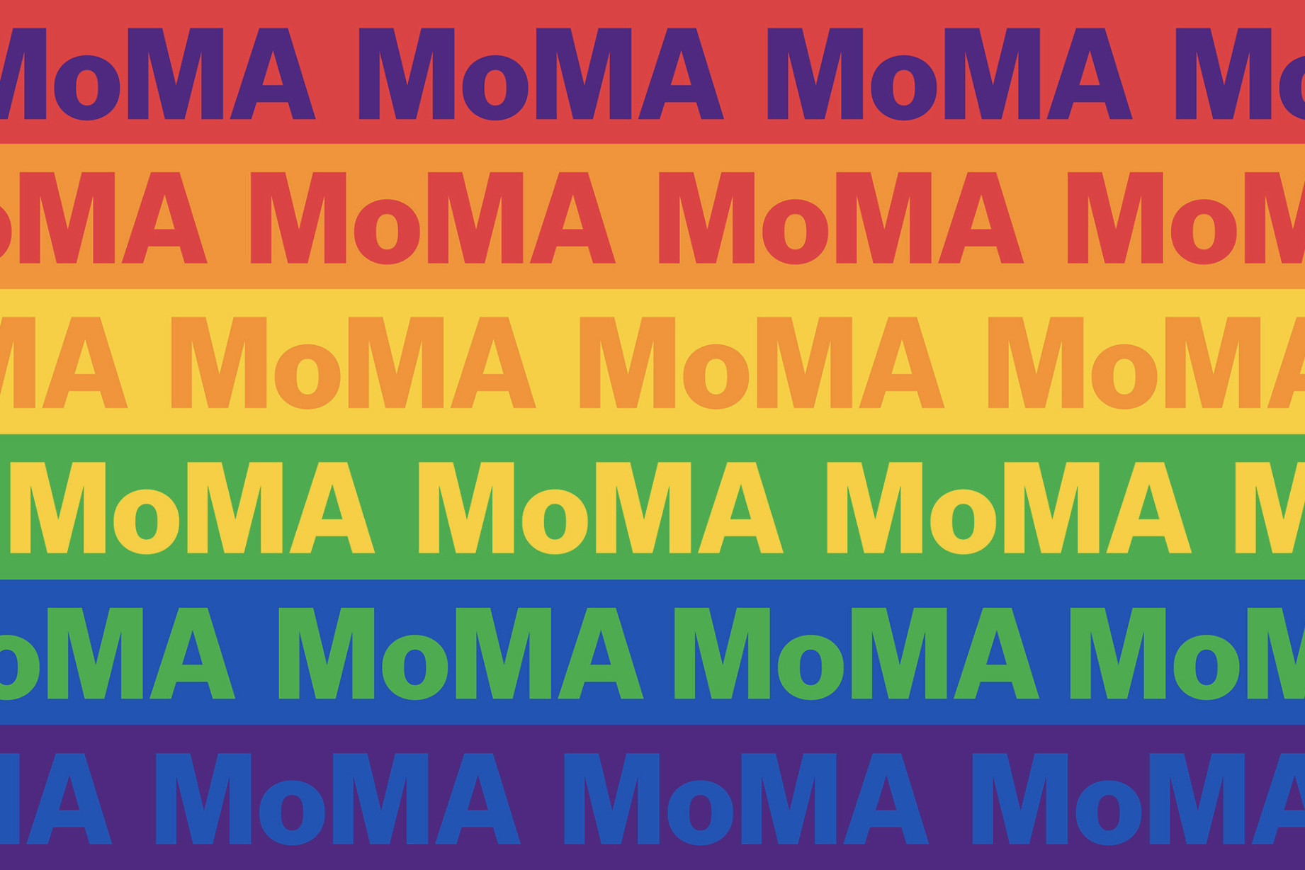
![]()
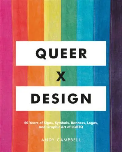
I also came across an excellent, beautiful book, Queer x Design, by Andy Campbell. I highly recommend it. There’s an interview with the author on Dezeen, which also highlights some of the designs featured in the book.
From that book, as well as my online searches, I came across the Gilbert typeface:
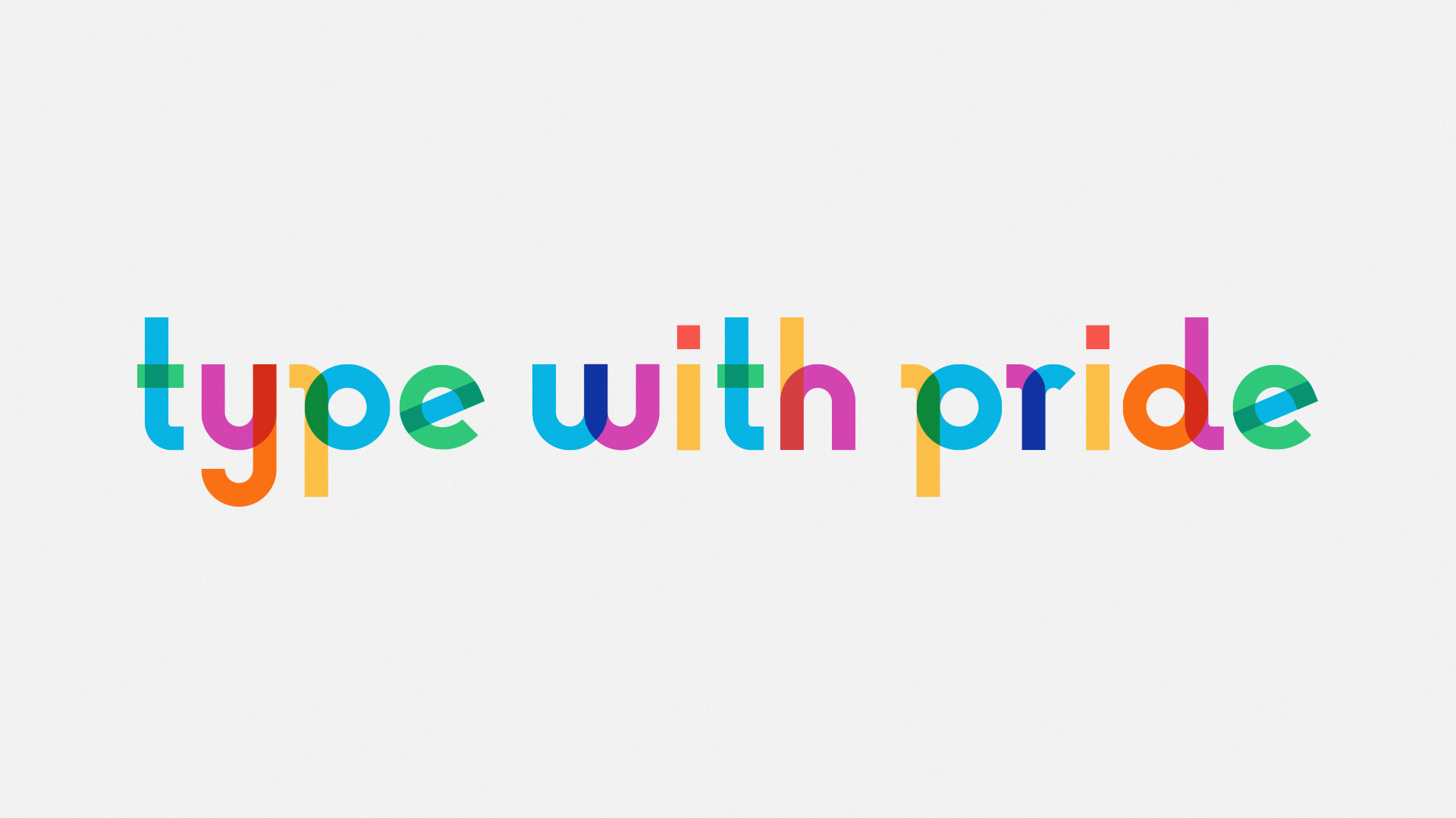
The Gilbert typeface was designed in 2017 (incidentally, the year that rainbowR was founded), in response to the death of Gilbert Baker, the designer of the original rainbow flag. It was designed to be used at scale – on posters and protest banners. Importantly, it is free, and released under the Creative Commons license, meaning it can be adapted.
The font immediately resonated with me and seemed like a great fit for rainbowR. It is clearly rooted in LGBTQ+ graphic design history. As I wanted for our new design, it is bright, clean, fun, modern and geometric. Crucially, it is also inclusive. As one of its designers said:
Our main aim was to keep it simple. Gilbert himself wanted to represent the LGBTQ community which is really an incredibly diverse community with a simple and beautiful design. He saw the rainbow flag as a medium in which to channel all these different aspects of sexuality/gender in a simple way. So we did the same. The shapes themselves are kept basic and geometric, not just representing the colors of the flag, but also the traditional shape of the rainbow ‘curved’ graphic. Also, the color overlay itself represents the intersectionality of all the diverse communities.
The new designs
With Queer x Design, the MoMA designs and, most importantly, the Gilbert typeface as inspirations on the LGBTQ+ front, plus the R from the R logo and the hexagon to represent our links to the R language and community, this is the new rainbowR hex sticker:

For use on social media, there’s also a square version:

And a banner:

Although Gilbert is a font, it turns out that it’s tricky to work with. Affinity Designer doesn’t have full support for colour fonts.1 I also wanted control over the colour combinations in each letter. Therefore, in Affinity Designer, I recreated the letters with shapes and used the colour-picker tool on an image of the font to get the palette.2
The Gilbert font is also released in a monochrome version, which I have now adopted as the font for headers across this website. I have experimented with using the colour version, but there are a couple issues with this. The colour font is not particularly legible. As mentioned earlier, it was designed to be used at scale. At smaller font sizes, or for longer strings of text, the colours make it hard to read, especially as some of them have low contrast against a pale background (and the darker colours where the shapes intersect also make it hard to read against a dark background). With control over the colours in the logo, I minimised the use of the low-contrast yellow and green. Another reason not to use the full colour version of the typeface is that not all browsers have support for colour fonts.
I have presented here the final designs, but it was a long, iterative process to get to them. I experimented with many other ideas. I am extremely grateful for the insightful feedback I received on earlier versions of the design, from members of rainbowR, from colleagues and, most of all, from my wife3.
UPDATE (June 8th 2024): After feedback on the legibility of the monochrome version of Gilbert for headers (too thick and poor kerning), I have now reverted to using Figtree for headers on this site. I had hoped to tie some of the text on the website to the font in the visual identity images, but legibility is more important. Moreover, the colours are at the heart of the gilbert typeface, and without them I wasn’t even convinced that the link was clear.
Footnotes
It is, none the less, a fantastic piece of software. Also, shout out to Affinity Revolution, whose courses provide a solid grounding in how to use it.↩︎
The colours in the animations of the font in the Type with Pride gallery are slightly more muted than the colours in the still images, and those that come with the font files, now distributed by Adobe. I used the brighter palette of the latter. Also, it seems the font went through a few design iterations. In the ‘type with pride’ image above, the stem of the ‘r’ has a curve. In the released version of the typeface (the one I traced), it is straight.↩︎
Who never wants to hear the words ‘and now what do you think of the design with this change?’ again.↩︎